AMULET DEVELOPMENT
Client
AMULET Development — development company in Kazakhstan. They build houses outside the city among nature. The design is developed so that the houses merge with nature and become a part of it.
Concept
The culture and nature of Kazakhstan is so diverse and beautiful. There are mountains and lakes, steppes and canyons and each of the beauties has its own special energy. In the concept, we depicted the brand's passion for nature and love for its land and traditions.

Idea of logotype
The brand is like an Amulet filled with the power and energy of nature. The developer already had a turtle logo and wanted to keep it in the identity as a symbol of well-being in the house. The shell of the turtle resembles a Shanyrak. This is an element from a traditional house in Kazakhstan, thanks to which light enters the house. And we combined these two symbols in a circle that formed our special Amulet.


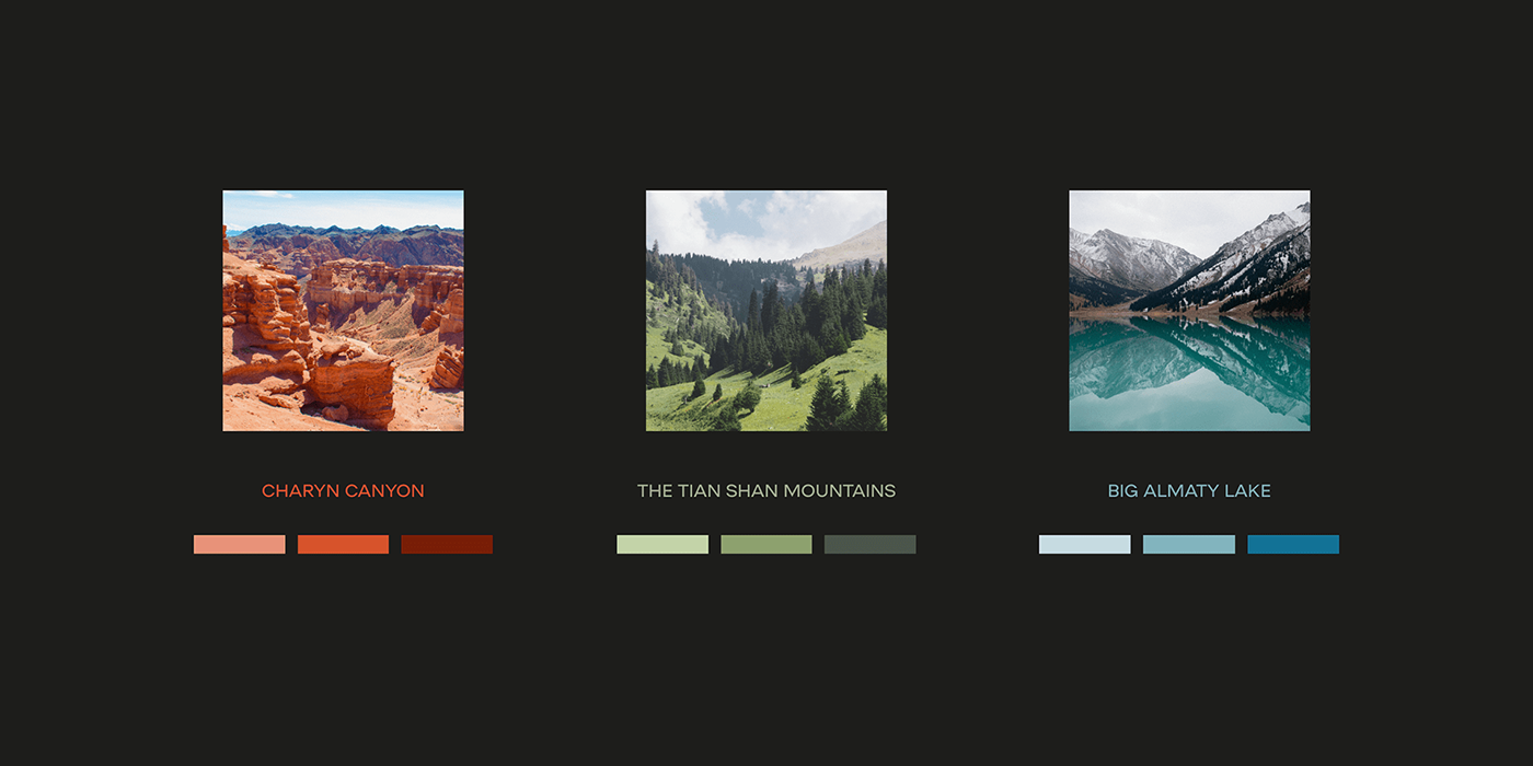
Idea of corporate graphics
The basis of the graphic is a gradient formed from the colors of different landscapes of Kazakhstan. The gradient will reflect the nature that surrounds the house: if there are mountains and a lake nearby — white and blue shades prevail in the gradient, if there are forests nearby — then green. The gradient has different dynamic shapes, reflecting the energy and freedom native to the nature of this country.